The Occupied Times: The aesthetics of protest
Joseph Maduma
January 22nd 2012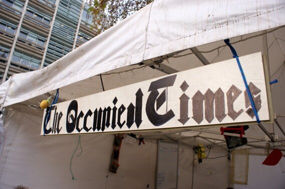
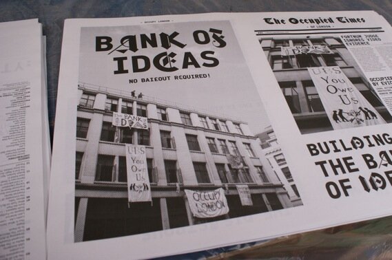
Since the first issue was published last October it’s been pretty hard not to notice and/or have an opinion about the ‘Occupy’ movement that has swept the world. From a few politically charged protesters fuming with the huge injustice of the financial system of Wall Street in America, their voices and feelings of being disenfranchised have been heard and picked up globally. Not least of all in London where #occpylondon was a huge talking point of the end of last year and has carried through into 2012. Whether you think they are right, whether you think they are wrong, I think there is a little bit of the Occupy protesters in all of us, my personal view being they have very worthy and just motivations and have been a catalyst for great debate but their organizational issues and public image have unfortunately lead them to be marginalized by the media and earn somewhat of a bad rep in reputable social innovation circles.
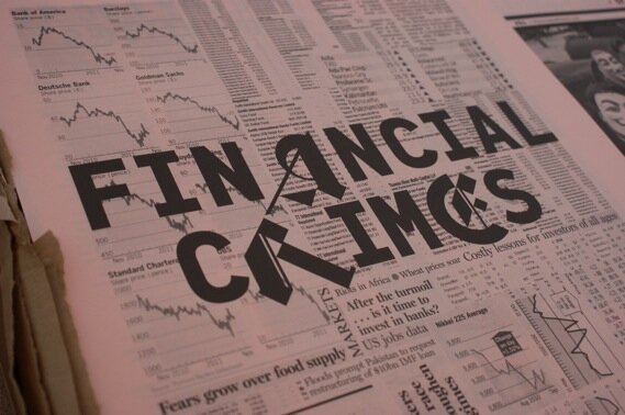
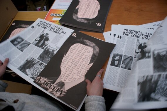
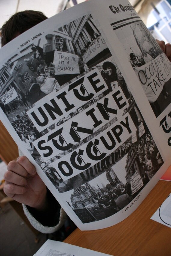
However political affliations to one side, the movement has manged to give birth to a little bit of iconic British graphic design history. ‘The Occupied Times’ is an attempt by the London part of the movement to provide a credible alternative to the media coverage. Directly subverting corporate culture it uses the asthetics of protest wisely, countering with provocative and intelligent articles that are mirrored in it’s aesthetic utilizing graphic designer Johnothan Barnbrooks ‘Bastard’ typeface to striking effect. They are clear not to make the content too radical however allowing it to have as wider readership as possible. Needless to say ‘The Occupied times’ is becoming something of a collectors item in the design world and rightly so. It’s a perfect example of what can be achieved when design talent mixed with passion and a real social cause to get behind can produce a relevant and poignant reflection of our times.
Excellent article and interview with the the designers on the Creative Review blog