Top 10 good designs / ideas of 2010
Joseph Maduma
January 19th 2011Ok ok, a little late I know, we’re already pretty much well established into 2011 but I thought what better way to kick off Good Design’s first official blog post than with a top 10 list of designs and ideas that inspired me, moved me, made me smile, made me go “wow” and made me think “I wish I’d thought of that!”
So in no particular order (it’s always far too difficult to order these things in terms of importance, impact etc so I’ve gone for alphabetical) here is Good Design’s top 10 good designs / ideas of 2010. Hope they inspire you as much as they have me, it was a great year for social and sustainable design and I for one can’t wait to see what 2011 has to offer!
To find out more about any of the projects just click on the title links.
1. 99% Campaign
You may well have seen these posters on the tube over the last few months. The 99% campaign posters are a great example of a strong idea executed simply and cleanly. The conceptual twist of the two nines forming the percentage sign for the identity is a lovely example of visual wit and the strong message of ’99% of young londoners do not commit serious youth violence’ hits home well. The campaign is a great positive take on what it means to be a young person in London and counteracts the sterotypes projected onto young people by the media and into public perception.
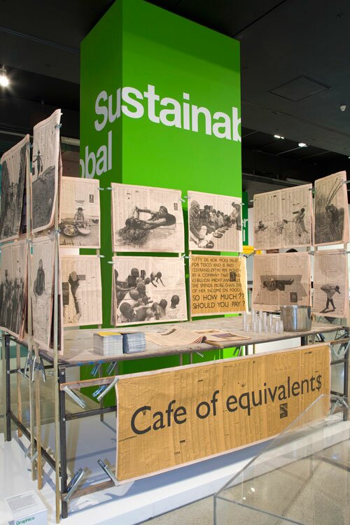
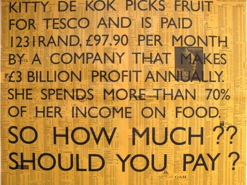
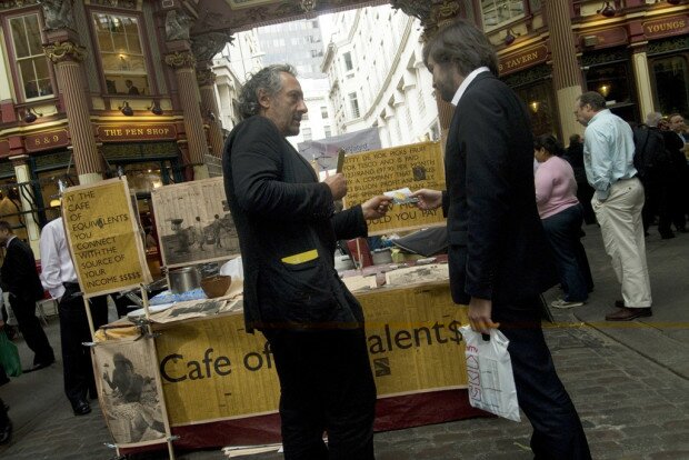
Cafe of Equivalent$ was one of the best projects at this year’s Brit Insurance Designs Of The Year awards. The designers kennardphillipps set up a lunch food stall selling food at a cost equivalent to food affordability in the producing countries. Soup and bread in Mozambique, for example, for a worker earning $2 a day costs 20 cents i.e. 10% of the daily wage. The same ratio applied to the average bonus-earning-banker means that soup and bread from the Cafe of Equivalent$ costs $181.67 (£111.20). In an era where money in the west has been so carelessly squandered by the banks to such devastating effect this is a stark reminder of just how unjust the financial system really is.
The girl effect is one of the animations of last year that truly moved and inspired me. It’s a brilliant campaign and animation and a first class example of what can be achieved when cutting-edge graphic design and typography are used for social change. It’s a powerful idea; by investing in girls in the developing world, we make an incredibly effective investment in eradicating poverty, creating thriving communities, and slowing the spread of AIDS.
4. myplace
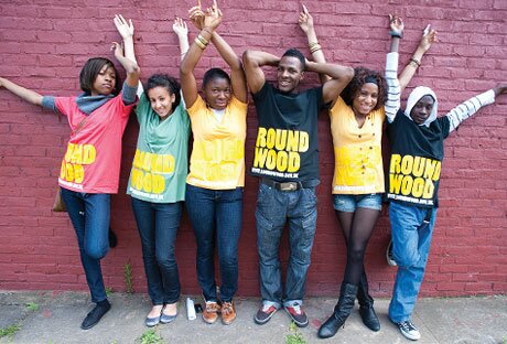
The myplace programme is an amazing example of what can happen when young people and designers collaborate on a co-design project. The young people were given the role of clients on each of the projects, and some of the UK’s top architects, designers and creative advisers were appointed to work for them: “Supported by Sorrell Foundation project managers, the client teams decided what was important for the architecture and branding of their centres over a series of workshops, inspirational visits and meetings with their creative teams, before presenting the final concepts to their bid teams and stakeholders.” Have a look for yourself, the results are outstanding.
5. Open Ideo
Open Ideo is a brilliant initiative by the brilliantly innovative people at Ideo. It’s a chance for anyone to try their hand at solving some of society’s most pressing problems. They describe it best: “OpenIDEO is a place where people design better, together for social good. It’s an online platform for creative thinkers: the veteran designer and the new guy who just signed on, the critic and the MBA, the active participant and the curious lurker. Together, this makes up the creative guts of OpenIDEO.”
6. Clever Little Bag
Puma
Question: So how does Puma get customers not to use plastic bags? Answer: Get rid of the need for the bag all together!
This is an excellent example of how using design thinking can save waste and take a completely fresh and innovative perspective on a problem such as packaging waste: “By providing structure to a cardboard sheet, the bag uses 65% less cardboard than the standard shoe box, has no laminated printing, no tissue paper, takes up less space and weighs less in shipping, and replaces the plastic retail bag.”
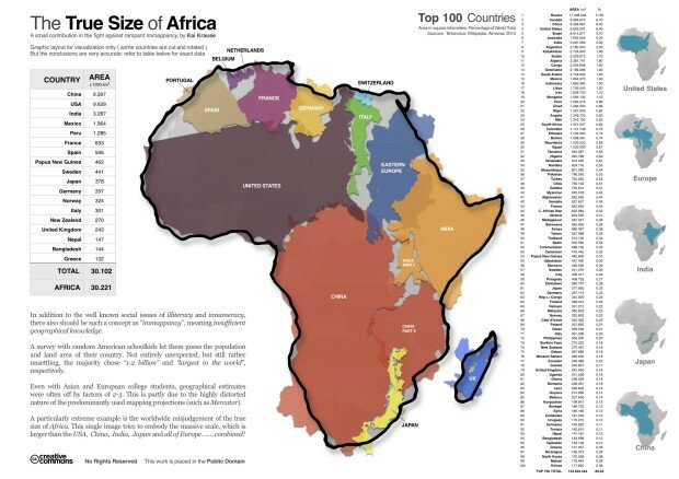
Its always tough to include info graphics in these type of lists because there are always so many great ones to choose from. But this one particularly took me by surprise and really made me think. They say the best info graphics change the way you look at the world and this one literally does. Africa is larger than the USA, China, India and all of Europe…combined!
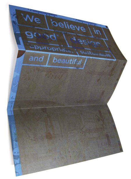
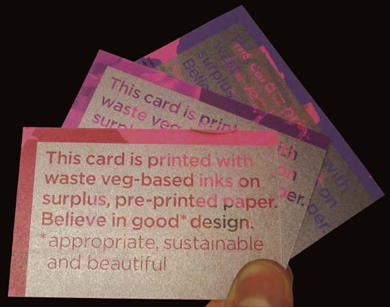
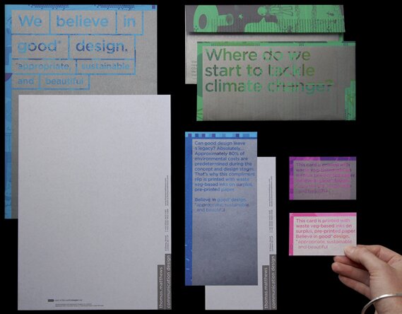
I couldn’t have put a top 10 list together this year without mentioning this Graphis Gold winning project from the masters of sustainable graphic design, Thomas Mathews. Their new identity system challenges the previous conventions of a studio (Thomas Mathews) – printer (Calverts) relationship and shows just what’s possible when the two work together to produce truly sustainable design: “We pushed ourselves and our printers to the limit, to create a set of truly fabulous stationery, that is: Appropriate – communicates our ethos through the message and the medium. Sustainable – has been produced entirely from waste materials. Beautiful – uses bold colours and opulent metallics to reveal inspiring statements.”
9. WWF File
This little beauty is a stroke of genius from the folks at WWF. Put simply it’s a PDF that doesn’t print out. So you can send your files safe in the knowledge that there will be no unnecessary paper wastage! So simple, yet so effective.
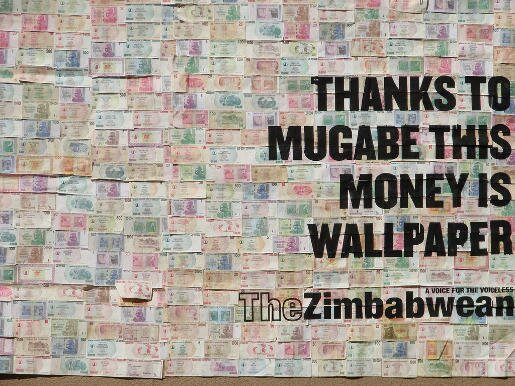
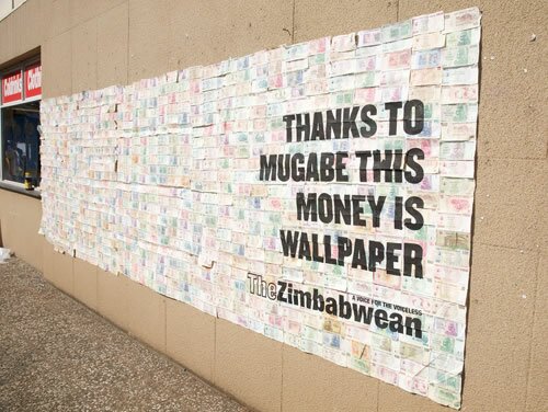
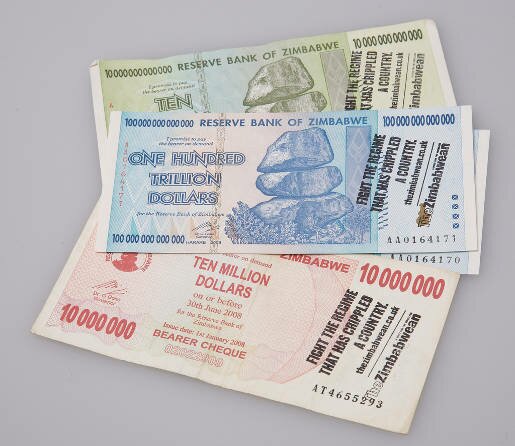
TBWA South Africa created this striking and hard hitting outdoor campaign for the Zimbabwean, a newspaper produced by a group of exiled Zimbabwean journalists. The Zimbabwean is sold in the UK, South Africa and Zimbabwe but in the latter import duty of 55 per cent is charged, making it unaffordable to the average Zimbabwean. To raise awareness of this, and to encourage more sales of the paper in South Africa, wall murals, billboards and flyers were created in Johannesburg using the Z$100 trillion dollar note, a symbol of the country’s world record inflation. Worth less than paper, The Zimbabwean has turned the money into its advertising, hoping to raise awareness of the dire situation in the country under the Mugabe regime.
