Dulux: ‘Let’s Colour’
Joseph Maduma
February 12th 2012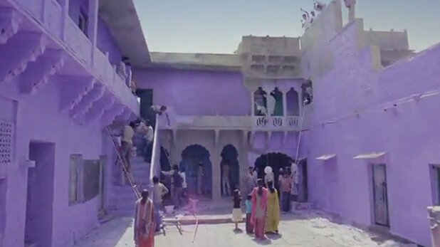
This week’s post really adds a splash of colour to the the pages of Good Design. AkzoNobel owned brandDulux have, along with their re-brand (or more of a brand evolution) added a rather charming and endearing brand mission ‘Let’s Colour’. Now granted this campaign has been around for a couple of years, so you may well be familiar with it! If so I apologize and please feel free to stop reading now. However if like me you are just coming across it for the first time, it is a really lovely case study of a brand not just designing a nice new shiny logo but bringing the brand to life with a simple yet on point brand mission.
In 2010 Dulux decided to resolve the issue of having many international variations of Dulux and condense them all into one brand. They launched the new global visual identity system created by London-based Design Bridge across Canada, China, India, South East Asia, the Pacific and the Netherlands with other regions following. But they didn’t stop there. Dulux, like all the best forward-thinking brands, realized that in order to remain relevant a simple logo redesign was not going to suffice. So they went right back to what was at the core of Dulux and asked themselves what does Dulux stand for and what is it that they inspire their customers to do? Their answer was, ‘Let’s Colour’. A simple, inspirational and motivational strap-line that empowers and encourages their customers to celebrate the transformational and emotional value of colour. But they didn’t stop there. They then said to themselves well sure, colour has the power to transform people’s homes but could it literally transform people’s lives? They certainly thought so and they embarked on the epic ‘Let’s Colour Project‘.
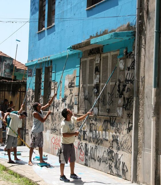
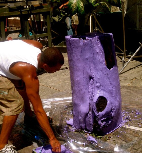

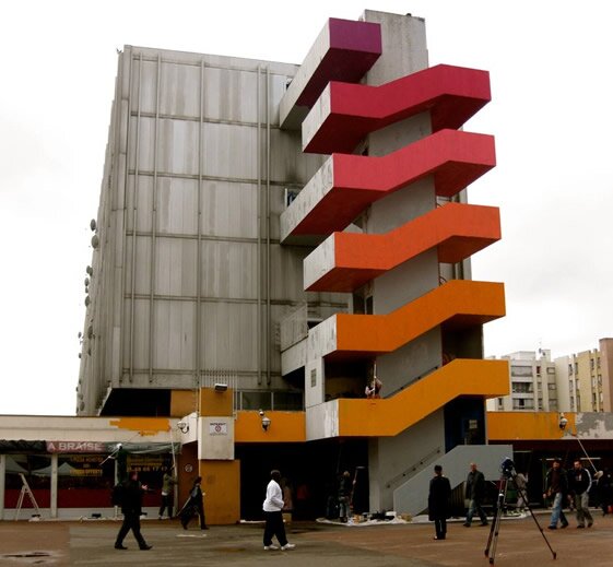
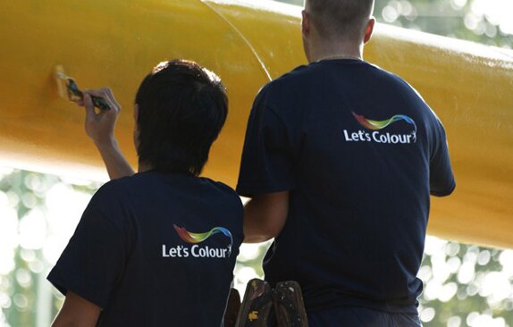
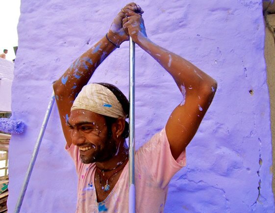
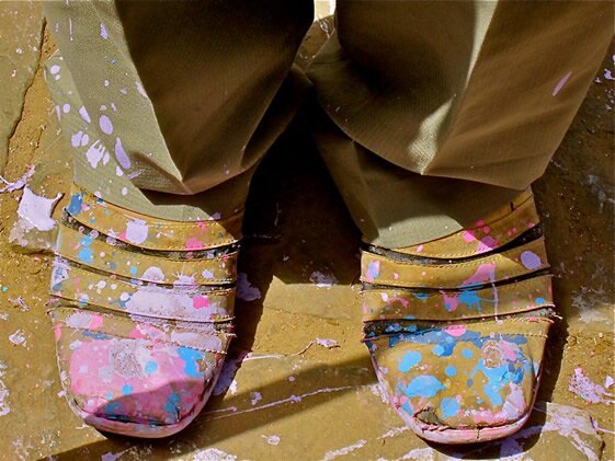
The ‘Let’s Colour Project’ sent groups of volunteers into local communities, globally, to help transform dull and grey spaces into vibrant colourful places to live using paint. The advertising agency behind it, Euro RSCG London, wanted to create a natural and interactive campaign that expressed the social mission of ‘bringing colour to people’s lives’ far more effectively and genuinely than traditional advertising. Alongside the project they set up a blog where people could keep in touch with what was happening in real time and interact via social media. It was and has been a huge success, brightening up communities from Rio de Janerio to London.
I accept that some people may think this is too high-minded for a ‘paint company’ and what real difference can a few coloured walls really make to deprivation in struggling communities ? But I would argue that Dulux, unlike many other global brands have set out with a promise they can actually deliver! Yes it is simple, but I think in its simplicity lies its beauty. They are not saying they can save the world, but they can make it a bit nicer to look at everyday with their product and bring joy to the humdrum of people’s lives. And what’s wrong with that? Nothing.